Changing your wall colour every time new paint colour trends are revealed can be a frustrating endeavour. Today I’m responding to an upset reader and addressing the one thing that paint colour cannot do for your room. It’s a lesson we can all learn from.
***Before I launch into today’s post, I have two jobs available, a remote customer service position and a personal assistant position, see both listings here.***
Interior Design by Maria Killam
Last week I received this comment underneath my recent post about pink beige:
“I have been enjoying your blog and e-books, and following your sage advice for years. In previous posts, you suggested using Benjamin Moore’s Manchester Tan (a green beige) to update pink beige finishes, especially as a wall color with pink beige tile or carpet. Do you still advise this color?”
This was my response:
Great question, Manchester Tan was a colour I specified all through the grey trend when a house had dated Tuscan finishes and my client wanted a cooler, fresher look. Now for the same house with the same dated finishes I might consider the same cream as the tuscan cabinets because now the trend is pale and airy. Hope that helps.
Then another reader read the above response and posted this comment:
This is a great question that I wish hadn’t been asked!! I repainted the interior of my “Tuscan” home (I prefer Mediterranean) to Manchester Tan based on your advice. So nice to know I spent over five figures and two years later I’m already outdated again!!??
May I add, the two years of research and angst I put into it, trying to find the right color with the right undertones, which is how I found your blog Maria. Apparently I spent too long agonizing over it and trying to convince my husband it was the right thing to do because in the meantime, the trends changed yet again?
I despised the gray trend and refused to go down that road. We are just now recovering from the financial strain as well as marital strain since he was against repainting our dream home that we built from the ground up. Now refuses to let me change the granite because of the tizzy from the repainting. And what would I change it to, anyway?? Who knows what will be in style next, and for how long?
I wish I could be as light hearted as those of you who can redecorate on a whim. It truly saddens me that even though we earn a good living, we cannot afford to keep up with trends and even if we could, my husband does not deal well with change. I guess it is easy and fun to redecorate when you don’t have to worry about these things.
Honestly this depresses me that less than two years ago I painted my home an outdated color! :((
I know everyone says “it’s just paint” but this is exactly why so many of us who love color will still not take any big chances and end up with analysis paralysis. I picked the best neutral I thought I could, based on a color expert and I still got it wrong. Ugh.
Let me just start by saying my heart hurts when I read comments like this. 💔 Having been in this business for 25 years, I know the reason why she’s really upset and it has nothing to do with the paint colour.
The thing about trends
There are a few other points I’d like to make before we dive into responding to this comment. And, here’s the first one:
When I worked in the paint store way back in the beginning of my colour consulting days, there is no brochure that would fly out of the store faster than the “colour trends brochure.”
And this is because as human beings, we are obsessed with all things NEW.
That is, anything recent or fresh and not part of the former is basically the definition of new. Most of us tend to be attracted to “new.” And that is how trends begin moving in one direction or another. Remember this video I made about who decides trends? Interior designers, decorators and colour experts are not the enemy, just the messengers. 😉
So, if you (or the previous homeowner) did not build or renovate your home using timeless finishes, will a new paint colour make your dated finishes go away?
Unfortunately, the answer is no.
I’m going to take a page right out of Day 1 of my Specify Colour with Confidence workshop to illustrate this point.
To decorate, or not to decorate?
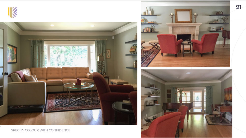
A few years ago, I arrived at a client’s home who was renovating her kitchen and re-decorating her great room. See that project right here.
As we toured her home, she paused when we stood at the entrance of her living room. She sighed wearily and said, “I know this room is dated but we never use it, so my husband doesn’t want to spend any money on re-decorating in here.”
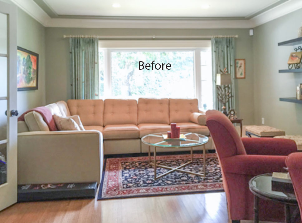
Before
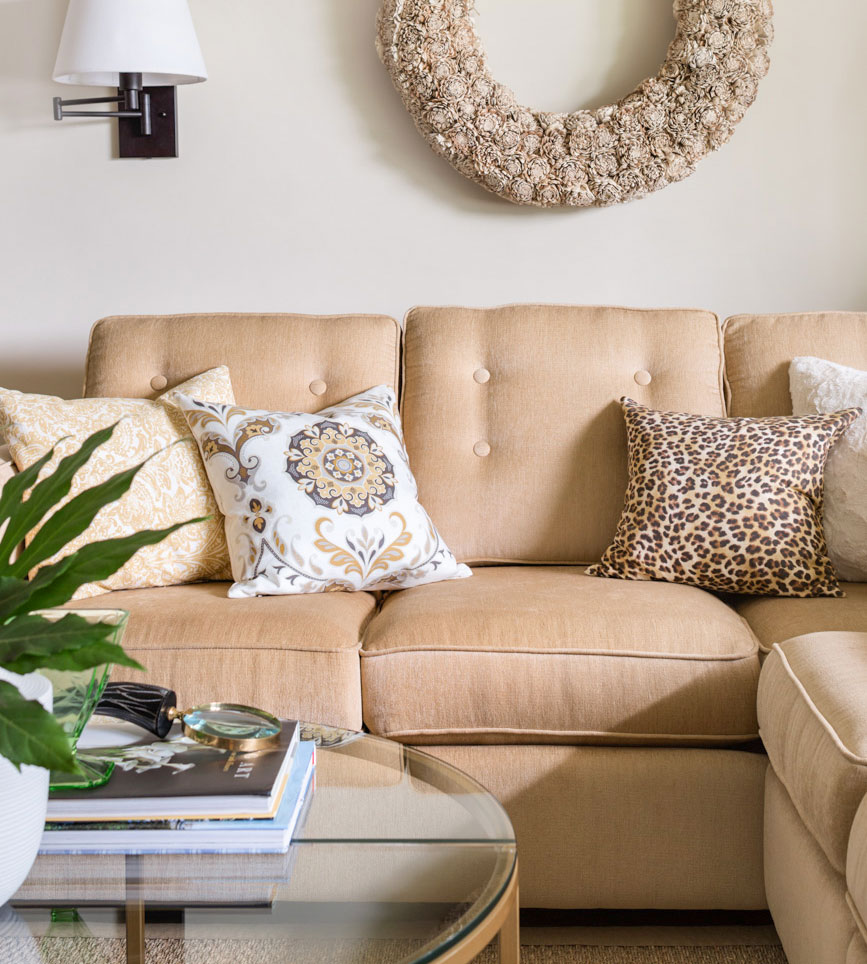
My response: “It really wouldn’t take a lot of money. All we need to do is paint the walls, remove the rust chairs and rugs, get some inexpensive off-white linen drapes, add in some seagrass rugs, take down the modern shelving that doesn’t work in this traditional room, move the antique desk to the other side of the room, and finally bring in some white and leopard pillows.” Done!
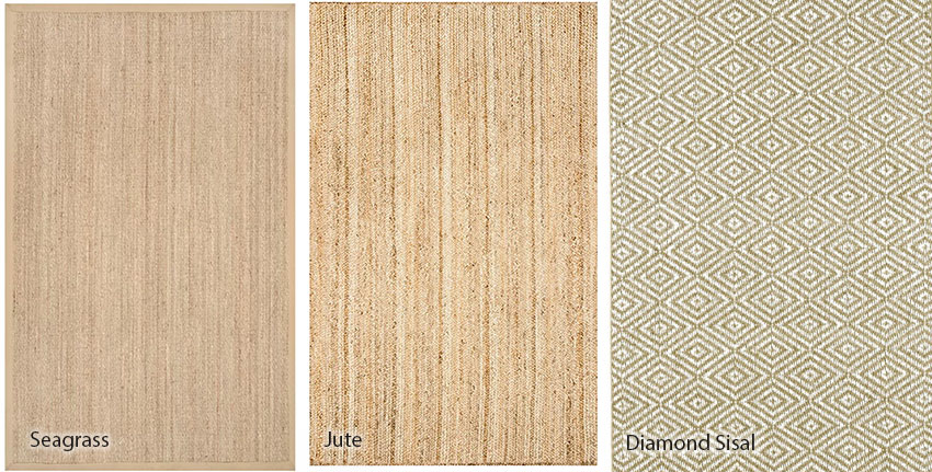
Seagrass Rug (22 sizes) | Jute Rug | Diamond Sisal Rug
Remember to review these rugs in the photos where they are laying down. Here the diamond sisal looks more green than the other two but this is how it really looks when it’s installed.
Anyway, we chose a seagrass rug, which was both inexpensive and neutral. Look how it freshened up this room after:
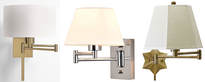
Notice the swing arm lamps? Absolutely essential installed behind a sectional or any sofa up against the wall.
You can buy lamps with a cord or hard wired:
Drum shade | Hardwired | Star light
Notice I’m showing only lamps with shades here. That’s because if your living room is already lit up with recessed lights, what you need is ATMOSPHERE. This is only achieved by the glow you get from a lamp with a shade. Adding yet another spotlight is not helpful, which is all this kind of lamp will give you.
I know, I can’t resist yet another lecture about lamps and how important they are to your mental health. I’m not kidding. The last two years has taken a toll on us all and everyone needs at least ONE ROOM that makes us happy.
It’s called LAMPS. I cannot overstate this enough because so many of you still don’t believe me.
If I had to choose between repainting my house from dated paint colours vs. lamps and accessories, I’d choose to decorate first every time.
That’s exactly what we did with my sister’s kitchen a couple of years ago. We had a $5000 budget, which meant we had a choice:
- Painting her dated, glazed, pink beige tuscan cabinets, a fabulous complex cream (which would have eaten up the entire budget)
- OR, updating light fixtures, adding accessories and a new table with upholstered chairs along with new valances and wall paint.
Which one do you think we chose? See that kitchen here.
Anyway, back to my story.
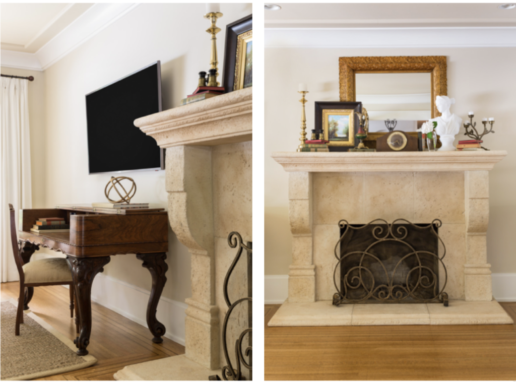
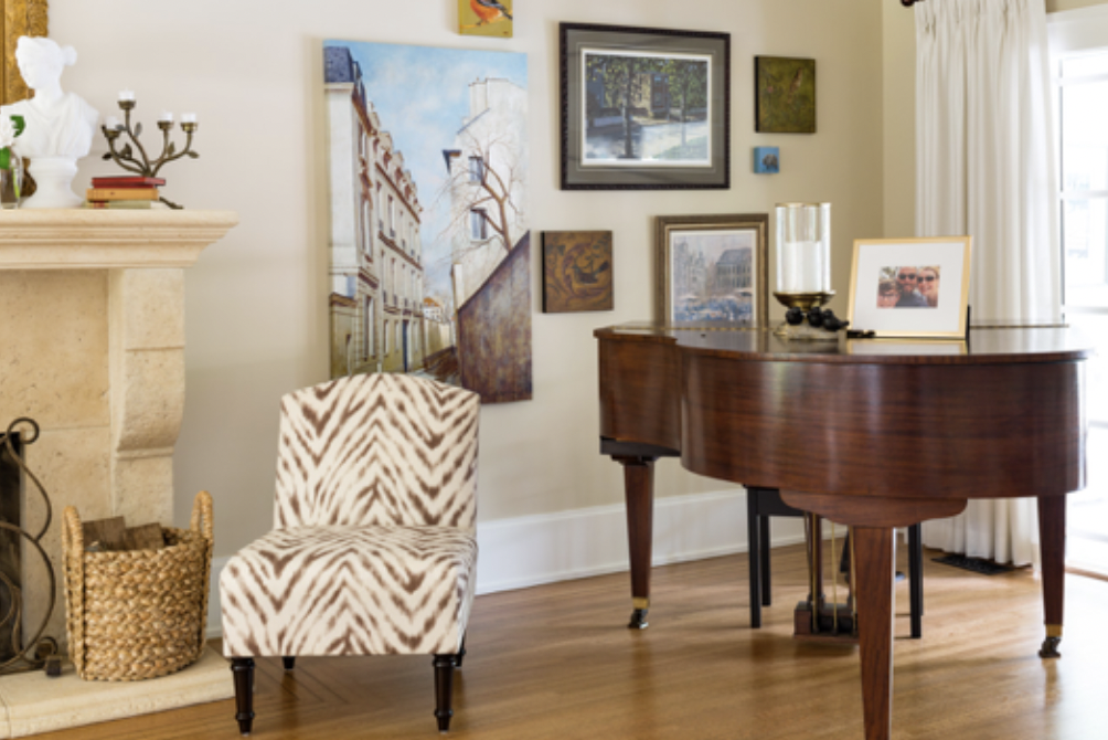
My client’s husband loved the makeover so much he immediately added a flat-screen TV (below left). I styled up the mantel, re-hung her artwork by the grand piano and TA-DA – so much better!
Notice her pink beige Tuscan fireplace (which by the way you could paint if you really wanted to) looks great with the versatile beige I specified.
And you might be asking by now, so what’s the paint colour in this room?
Maybe you guessed it? That’s right… it’s Benjamin Moore Manchester Tan (or its equivalent Sherwin-Williams Wool Skein). Both of these paint colours are in my Bonus Book of Paint Colours located at the back of either of my ebooks. And, it’s probably one of the most versatile green beiges there is in this world.
I cannot tell you how many times I have been in a colour consultation that when all else failed, Manchester Tan won yet again. After I place my large painted colour board down on the carpet or behind the upholstery or existing drapery, or next to a kitchen tile or countertop – this colour was a fit, hands down.
This takes me right back to why my reader is upset.
It’s not about the paint colour
She is not upset about Manchester Tan, which quite frankly, is just one shade darker than a green beige complex cream.
And, if in fact, we are going to split hairs here on trending paint colours, I’ll remind you that beige is back, as I’ve been saying for a couple of years now. This means that within a few short years, all the stark white walls we’re seeing will also feel DATED and colour (including mid-tone beiges) will be all the rage.
Therefore, my reader’s light green beige will actually be trending again. So, perhaps she needs to consider that she’s actually ahead of the trend? 😉
I don’t know about you, but all this discussion about trending paint colours is totally exhausting. Would you agree? (especially considering my lovely reader’s anger has nothing to do with paint)
For starters, it has to do with the fact that she’d like to change her granite, which is not in the world of marble. And, technically would have been the most timeless countertop.
But what this all comes down to is decorating. Or, what I like to call creating a look and a feel.
We’ve all been there
If we had taken the above room in the before state, and just painted it white or cream would my client have been any happier? Immediately NO.
There are many, many homes right now painted stark white just because it’s trending. And many of these homes have no business being white in the first place. Whether the paint colour is of the moment or not is of minimal consequence, what matters is whether the room looks and feels beautiful and inviting.
And that my lovelies, still comes back to decorating.
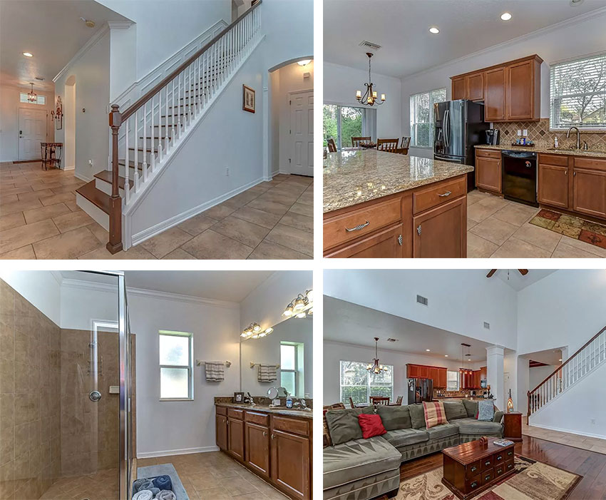
I mentioned this on my Instagram stories Sunday afternoon right after I wrote this post and one of my followers sent me this listing with a Tuscan house painted white:
This homeowner or real estate agent thinks that if they just paint the house the current trend colour, ie. stark white, that it will sell the house when all it does is highlight how dated it is, and on top of it all, the abundance of stark white walls make the earthy finishes look dirty in comparison.
Read more: 3 Surprising Reasons your Colour Scheme looks Dirty
Can I just say dear reader, I feel your pain.
There are way too many homes, built with Tuscan (or what my reader refers to as Mediterranean) finishes at great expense. We see them every day in my eDesign department. It’s the reason Terreeia and I still haven’t moved, because the area we live in is filled with expensively updated homes built in the 70s or later with zero charm or character. We’ve looked at house after house with extremely dated and bad finishes, so, as my reader below stated, we’d have to build to get what we want.
The last time I received an email like the one we’re talking about, I also wrote a similar post about styling here.
Read more: What’s Missing if Your House is Not Trendy (Who cares?)
This was the comment I received on one of my posts 5 years ago:
“I have been reading your blog for about a year now, and I have learned quite a bit about color and undertones from your books. However, I regret that I have to unsubscribe from your blog.
You see my house was built in the Tucson brown trend and believe it or not it seems to be still going strong here in Oklahoma. As a result, I get depressed looking at all the beautiful fresh and clean white interiors, and until I am able to build a house I won’t ever have a house that is fresh, clean and white.
I finally talked my husband into painting the kitchen (used your book of whites and big samples to pick the color) and it looks so much better but the counters and floors are still brown. He refuses to paint the trim and replace the doors especially since nothing is wrong with them.
I thought we could move but most of the houses in this area are the same, so every house I look at, I want to change everything in it. Hence, the reason I am giving up until we can build.”
Do you notice a theme here?
Underneath my first reader’s comment, one of my long time subscribers came to the rescue, she posted this comment:
Manchester Tan is a beautiful neutral colour and I am sure your home looks lovely! The paler walls aren’t for everyone. Accessorize in your favourite colour, add some creams (if you want) and enjoy your home. With social media I think the trend cycles are going to continue to get shorter and shorter . . . I love having Maria keep me informed of current trends . . .I decide if/how I implement them. I agree, painting is not cheap!
In addition, the responding reader also sent me this note:
Dear Maria, I painted my 2015 new build your SW Agreeable Gray and Sea Salt and couldn’t be happier. Thank you for that. I am not agonizing because it is not paler. I’m guessing she never got her “look and feel” you always stress with styling
PS. I know . . . More lamps needed
Let’s look at the original before and after from my client again, shall we?
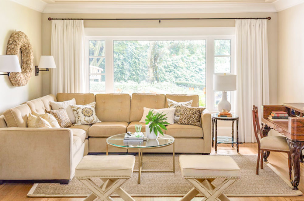
After
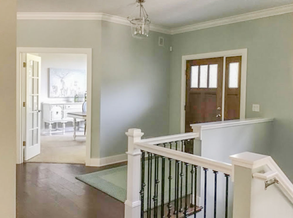
My client above has since moved into another home and now her gold beige sectional is in a TV room upstairs. She arranged some wonderful artwork around the sofa. And, as per the current trend, we chose one shade lighter than Manchester Tan.
In this case, her existing broadloom is pink beige but since the sofa obviously takes up more visual real estate than the wall-to-wall carpeting, we chose instead to choose a colour that works with the gold beige sectional.
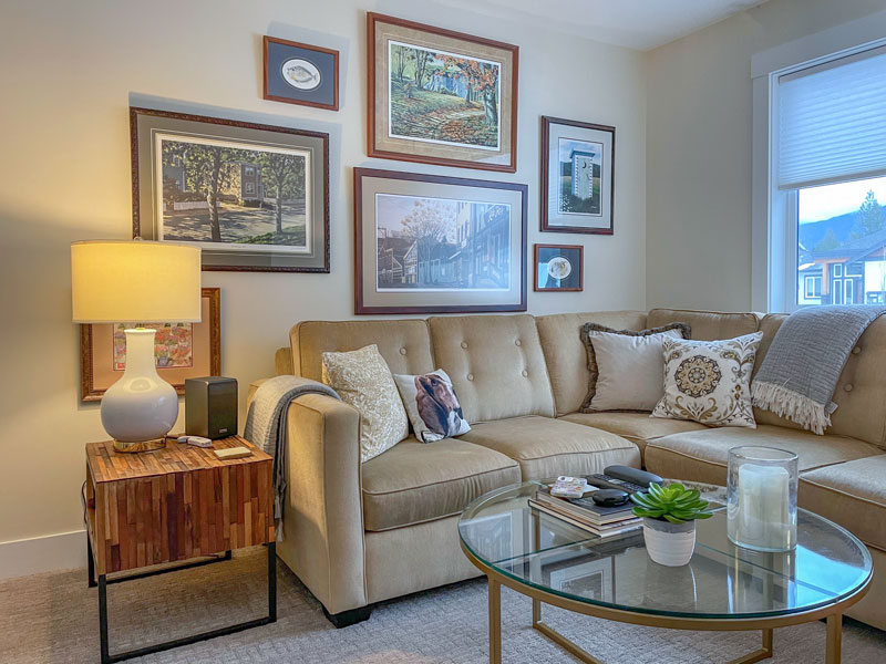
BM Feather Down
Stop chasing paint colour trends
The moral of this story is please stop stressing so much about updating the paint colours in your home.
Yes, all the white rooms we’re seeing everywhere do appear fresher than ANYTHING else does right now. But chasing an all-white room doesn’t end with paint.
At the end of the day, pale neutrals, and especially a colour as versatile as Manchester Tan are the essence of timeless.
Completely trend-proof.
Even if we are specifying the very lightest of the neutrals to satisfy the trending appetite for super pale “white” walls, neutrals only one shade deeper than the complex creams and greiges are absolutely in the realm of timeless and fresh.
And again, I think we will see paint colours warming up again as the world wearies with having to “warm up” stark white rooms with LOTS of clever decorating.
MY BEST ADVICE: Pick the room you spend the most time in and spend your money there. Spending a little bit of money in each room and not finishing those rooms will still not give you a house that fills you with joy when you walk in the door.
Related posts:
My Sister Elizabeth’s Fresh (but still Tuscan) Kitchen Makeover
How to work with your Dated Granite Countertops; The Ultimate Guide
Timeless Design Tips for a Home You’ll Love Forever

