

“I almost didn’t want to sell it,” Annie Segal tells me about this gorgeous house she and her business partner Marieke Ochtman flipped and recently sold here in Los Angeles. It’s located in a beautiful, tree-lined neighborhood on a 1/4 acre plot of land that backs up into Griffith Park. Once you see all of the details in this stunning California casual home they designed with their company ASOM HOME, you’ll understand why it was hard to put on the market and let go.
But first to get your renovation juices flowing, here are some fast facts:
- The full gut renovation took 10 months to complete
- The home is 2,654 sq. feet
- It originally had 3 bedrooms and 2 baths, and after the renovation now has 4 bedrooms and 3.25 baths
Now that you are armed with the stats, it’s time for some before photos to set the scene:


It was a little rough around the edges but Annie and Marieke clearly saw a ton of potential and charm in this 1960s single story 3-bedroom (turned 4 bedroom) home.
If you’ve ever wondered, “where do you even begin when taking on a full gut renovation?” you are in the right place (and frankly, reading the right blog). Even though I know every reno is different, this was one of my burning questions for Annie. Her response was one I have heard before and it makes a lot of sense. She starts by going to Pinterest and pinning inspiration like mad. Sound familiar?? It’s also exactly what Emily does before any project. When you have a massive project looming before you, it helps to find all the inspiration you can to nail down what style/vibe/feeling you are going for. When you have to start ordering things like cabinets as soon as possible due to incredibly long lead times, it helps to be confident in the style you want VERY early on. For Annie and Marieke, after a lot of pinning and collaboration, they knew they wanted to create a calm, inviting home that feels like a vacation but still has a lived-in, eclectic feel.
With a full gut renovation like this, Annie shared that the hardest part was waiting for permits, enduring the shipping delays, and accepting extra long lead times. I am sure many of you can relate to that. But one thing Annie and Marieke had going for them is they work well together, they listen to and feed off of each other’s creativity, and they have fun doing it. Annie’s biggest tip for flipping homes if you are a beginner?? Find someone like Marieke who has been renovating houses and hotels in the US and in Holland for 10 years. That experience plus their undeniable working chemistry made the project so special (something I found palpable and so endearing while talking to Annie).
But that’s enough background. Let’s get into the reveal:

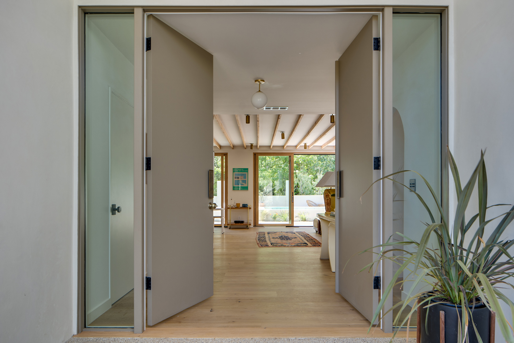

When you enter the home, you step into the entryway that leads to the open concept dining area, centered between the living room and kitchen. Even though I have only virtually toured the home just like you are about to, it’s easy to sense how calming and inviting it is right off the bat. Everything from the light wood floors, to the awesome floor-to-ceiling sliding glass doors, to the warm finishes, gives off a sense of calm and tranquility. It’s like you are entering vacation mode as soon as you walk in.
When I interviewed Annie over the phone, it was clear how passionate she is about renovating homes and in particular, how much love and care she and Marieke put into this one. There is so much thoughtful intention and attention to detail because they design homes as if they are designing for themselves. They always think about what they would desire in a home and apply those elements thoughtfully. And because they are both lovers of pattern, color, and bold designs there is no shortage of design risks here. So with that said, let’s head into the design risks and nitty-gritty details.
Design Risk #1: Task Lights Instead Of Canned Lights

There is so much about this living room that I want to highlight, but I’ll start with the ceiling lighting. One of my first questions for Annie was how they came up with the ceiling lighting plan because the task lights are unexpected and so cool. The way they are lined up in rows almost as if on a track really got my attention. A safe choice would have been to opt for canned ceiling lighting, but as you’ll see throughout this home tour, “playing it safe” is not their forte. Clearly, the options for ceiling lighting were limited due to the exposed ceiling beams (more on those below!) but the task lights are still a unique choice here. She informed me that they got these custom wall sconces from Rara Forma and just loved how they looked on the ceiling so they installed them across the living and dining room all the way to the kitchen. SO cool. They give off similar light as canned lighting would, but the exposed cylinder shape and brass finish are visually much more interesting.

Okay, now I can finally talk about the exposed beams. The truth is, they are my favorite design element and they are the first thing I asked Annie about. Are they original? Structural? Solely for aesthetics? I had to find out.
Turns out the beams were found during the renovation under the popcorn ceiling so of course they kept and restored them. I think with all the ups and downs that come with renovating, one major win has to be when you start removing a ceiling and find awesome beams that could bring in so much architectural interest. They refinished them, filled some holes, and stained them so they look modern and intentional. I am so happy they chose to keep them because can’t imagine this home without them.
Before we move on to the next room I think the fireplace deserves some recognition. It’s a beautiful, minimal focal point of the room so I had to know if a fireplace existed there before the renovation, or if it was an addition later on. Annie informed me a fireplace was there but they restored and redesigned it to match their intended laid-back California cool style. I just love the smooth stucco finish that integrates with the walls and the raised hearth. (Hot Tip: If you are renovating and thinking about your fireplace options, Emily wrote an in-depth guide here).
Now onto the decor. The home was styled and staged to sell by Pop Up Home, who did an incredible job accenting the architecture and MCM-meets-California-casual style with eclectic, vintage pieces. The amount of textures alone in this room (boucle chairs, jute rug, tiled coffee table) makes this room unmistakably cool. Also, is that a camel statue in the corner?? Why yes, yes it is.

Can you believe at one point the living room, kitchen, and dining room were all separated by walls?? Removing those walls was a no-brainer and the result is this incredible light and bright space. Open concepts famously “open” up the space, making the vibe more relaxed and inviting. But this layout also fulfilled another purpose. Annie shared that they really wanted the outside to feel like an extension of the living room, so having everything open and airy helps invite you to take in the outdoors.
Can we take a second to note the black accents here? In this mostly neutral room, the black pendant (stunning) and the black stools (equally stunning) really pop and break up all the warm tones making the space feel more dynamic. Now if you look out through the glass doors, the black casing around the exterior doors also pops against the neutral interior, accentuating the continuity between the outdoor and indoor space.
Design Risk #2: Oval-Shaped Kitchen “Island”

Though not technically a stand-alone island, the extended oval counter has me swooning. I love that it is extra-long and the curved countertop extends out past the cabinetry. The round shape mixed with a lot of hard straight lines adds movement and just the right amount of visual interest to this room. It’s exciting to look at and softens the space at the same time. It also plays off of the arched doorway in such a lovely way.
Speaking of round shapes, did you notice the bulb sconces? I love how they halted the task lighting from the living room on one side and added bulb ceiling lights to zone out the kitchen area. And then to top it off, the extra two sconces on each side of the hood are *chef’s kiss*.

How cool is that secret door? It leads to the pantry and is just one more example of how this design duo keeps us on our toes. In case you are curious (I know I was) it is more pricey to install a secret door but Annie informed me there are actually hidden door kits that you can buy to make the installation easier. The more you know!

Uh oh, after seeing this shot I just added one more life goal to my list: to have a wet bar in my home. It’s technically not my fault because this one is perfect and hard to forget about (I’ve tried). I love the retro triangle-shaped tile design that speaks to the MCM architecture and how the terrazzo countertop adds a cool texture. The woven cabinet fronts are so beautiful and also bring in the MCM vibe that just feels right for a wet bar, don’t you think?

I love how the kitchen is kept light and minimal by having no upper cabinets. It just feels right with the relaxed vibe of the home, plus I know there is plenty of storage because they custom-designed the cabinetry themselves. Once designed, they had a local woodworker who works on all of their projects build it for them. In fact, Annie and Marieke designed all of the kitchen cabinetry including the tall wood cabinetry on the other side and the cabinetry under the wet bar, and then their awesome woodworker made it all come to life. What a literal dream team! I personally love how the muted green color here mixes with the lightly veined marble and brass knob accents. It’s understated but still has that special custom look.
Design Risk #3: Beams Over Skylight

If you’re an avid reader of this blog, you probably can guess what I am about to say. We are BIG, resounding, perhaps annoyingly faithful advocates for skylights. They are simply undefeated when it comes to adding natural light, and every space benefits from organic natural light. This skylight in particular is interesting though because the beams from the living room extend to the kitchen and do not break for the skylight. This was an intentional design choice to keep the continuity and flow that the beams create across the living room and kitchen. All of us EHD ladies loved this choice and think it was such a cool risk to take (that 100% paid off).

I mentioned in the beginning that this was originally a 3 bedroom home, but Annie and Marieke saw the potential for a primary bedroom addition. It extends into the backyard with glass sliding doors facing out towards the pool, again emphasizing bringing the outdoors in. I love that this room has not one but two sliding glass doors so you really feel drawn to the outdoors. I imagine there is no desire to be a hermit in this room!
Before we move on, some decor elements I can’t get out of my head include but are not limited to: the double leather lumbar pillows, the tall matching sculptures on each nightstand, that amazing zebra print chair, and the “too small” rug. All those details create such a warm yet eclectic vibe that is intoxicating.

Design Risk #4: Mirror Mounted Faucets
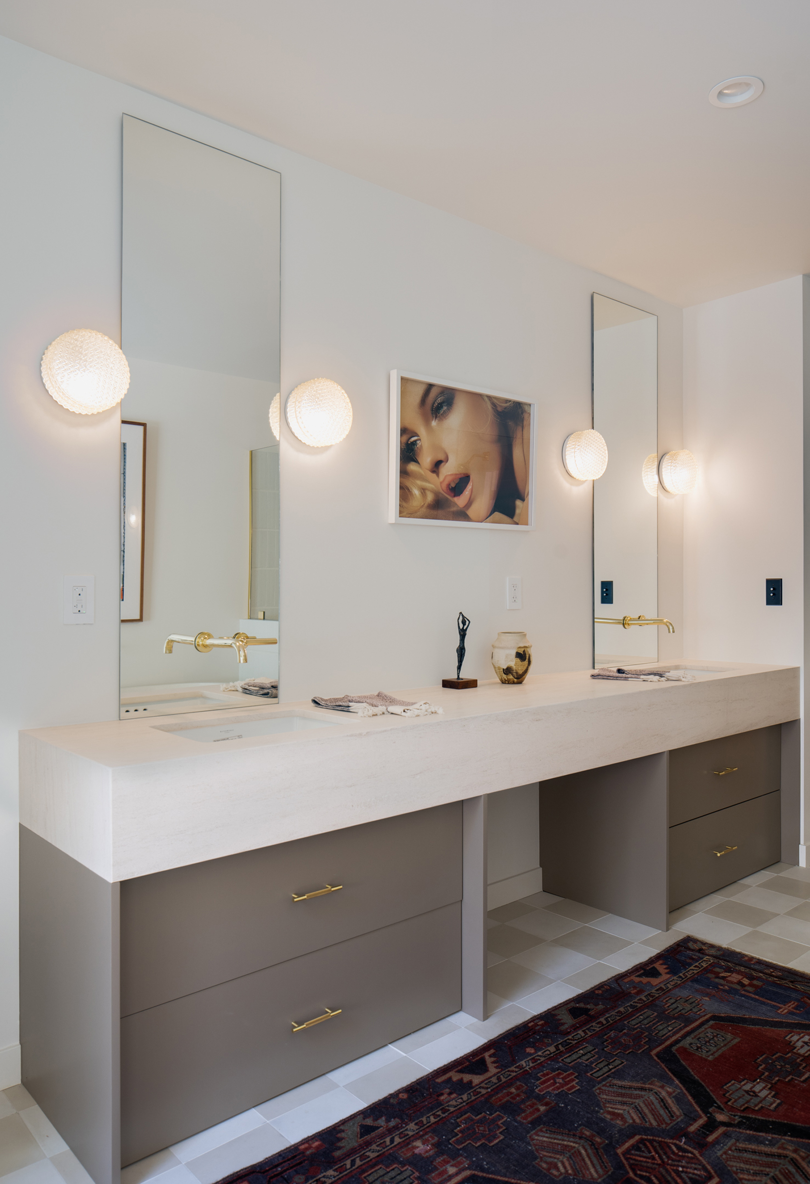
Another subtle but impactful design risk enters via the mirror-mounted sink faucets. This is an up-and-coming trend we’ve been seeing and can’t wait to see if it will really take off. My guess is that it will because it looks high-end but isn’t a far jump from wall-mounted faucets. They are installed by cutting into the mirror, so it is a little precarious and labor-intensive but the result is really special. It can look classic but is a surprising option if you want to create a minimal but impactful design moment. Plus, you can go for a simple mirror and it will elevate the look instantly.

I love this shot of the arched doorway. Remember when arches re-entered the zeitgeist and we all felt like the main purpose in life is to have arches in your home?? I might still feel that way after seeing this.
Quick side note: Did you notice the short tile wall that separates the shower and bathtub? The thick horizontal grout lines mixed with the thinner vertical grout lines create a very subtle but impactful tiny design moment. So good.

Have you noticed all the window treatment-less windows? Are you annoyed with all of my rhetorical questions yet? Okay okay, I’ll stop. Back to the windows – as long as you have privacy, it’s a great way to have the outdoors become a part of the interior decor. The windows act as a way to literally “frame” the outdoors and in that way, can replace the need for art.
Design Risk #5: Asymmetrical Pendant

Anything asymmetrical is going to pack a design punch and is a tad bit riskier than going the symmetrical route. We always say that a powder bathroom is a fantastic place to play with trends, bold colors, fun details, and of course, wallpaper. I love how the off-center pendant is balanced with the faucet on the opposite side. And that sweet pink basin?? I am obsessed.

I have to say, every time I stare at this photo something new catches my eye. The unexpected art placement is wonderful, the double lamps and matching MCM nightstands are classic, I love the tight woven detail on the accent chair, but the large almost floor-to-ceiling window might be my favorite detail. With a plain room like this (structurally speaking), the window is essential for breaking up the walls and I think the choice to go for an oversized, vertical window instead of a horizontal one was a really exciting and unexpected choice.


I count not one, not two, but three tile shapes in this bathroom. I really love how the green cement tile (by Zia Tile) stops halfway up the wall, is replaced with narrower white tile, and then that tile stops before it hits the ceiling. It helps draw your eye up and yet grounds the space to keep the tile from feeling too overwhelming. And against the white and muted green color, the matte black finishes really pop.
Design Risk #6: Monotone Walls And Ceiling


Paint isn’t permanent but painting a room wall to ceiling this daring pink color wouldn’t be considered playing it safe. It’s true that monotone rooms are trending right now and I think this room could be conducting the train that I am about to hop on board. To make this trend work, you must pick a color that is special but not boring, bold but not too overwhelming. This peachy pink color achieves just that because it is easy on the eyes but feels fresh and exciting to look at.
Now if you are looking at the closet doors and wondering if they are original then you and I are on the same exact page. I asked for all you inquiring minds out there and yes, they are indeed the original closet doors. I love how the shape of the dowels speaks to the whimsical vibe of the room.
Design Risk #7: Oversized Shower Tile

More permanent finishes like tile are always going to be a little riskier to go bold with. In this bathroom, the chunky, cabana stripe tile in the shower makes an exaggerated statement that you can’t deny. What makes it even more enticing is the two-tone pink colors that add a playful effect that may not be “timeless” but packs a huge design punch. Finally, the brass shower head finishes add the perfect “jewelry” to round off the whimsical design.

One last note about this bathroom that makes it so special: It has this indoor/outdoor look and feel to it and that is because of the smooth stucco walls, which is (intentionally) the same finish as the exterior. Which brings me to the backyard!

When I asked Annie what her favorite room is, she didn’t surprise me when she said the backyard–and it’s not just because of how idyllic it is. It’s also because this is the first backyard design plan Annie and Marieke have ever executed and it’s STUNNING. Isabelle Dahlin Design (founder of deKor Living) assisted with the front yard landscaping, and once that part was completed it helped them reimagine the backyard. They planned a whole new layout including designing the awesome raised pool (scroll down to see the before and after – it’s dope). Then the tile was custom designed by Annie and Marieke and hand-poured. They used terra cotta pavers from Clay Imports and laid out the design by hand, measured the spacing between each one, and then it took about two weeks of labor to pour the concrete, place the pavers, and smooth it all out to be flush. It’s AWESOME and one of my favorite details.
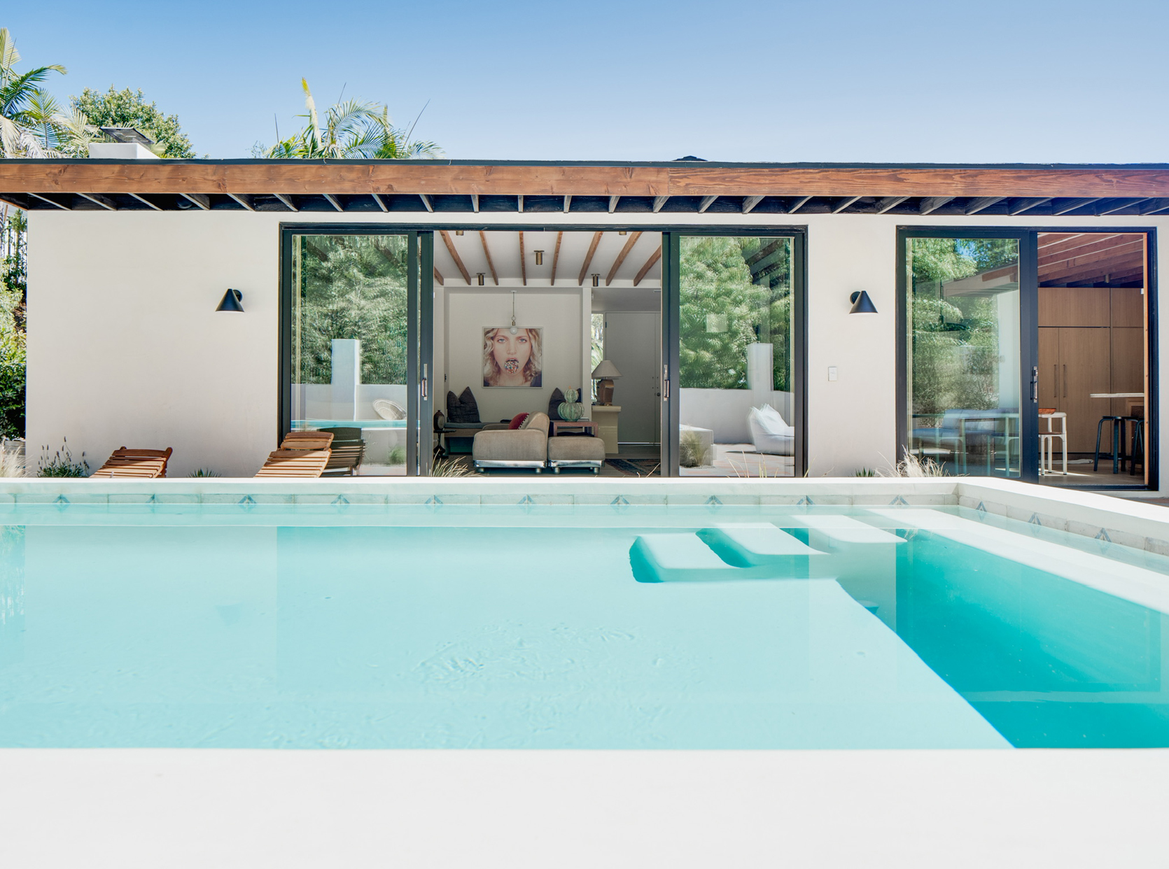
Earlier I mentioned they wanted the patio to feel like an extension of the living room. Carving out a lounging area right outside is one way to do so, but this is also executed by having the pool raised rather than flush with the tile. The raised pool makes it feel like its own zone, so the rest of the patio becomes seamless with the indoors. It reminds me of a hotel pool, which isn’t totally surprising since Marieke has designed so many hotels herself. Like I said, this home was meant to feel like a vacation, and having everything open, airy, and seamless helps achieve that vibe.

To end the tour, we have this private little outdoor space right outside the primary bedroom and bathroom. Remember how I told you Annie and Marieke design homes as if they are designing for themselves? Well, this is another example of how they do just that. Knowing that privacy is a luxury, they really wanted to create a private outdoor zone so they added the tile wall to create this little outdoor nook.
And now, as a well-deserved treat for reading over 3,000 of my words, here are the spectacular before and afters:


Huge thanks to Annie and Marieke for sharing this project with us. It was such a blast for me to pore over every detail and I hope you had fun reading along :). I’d love to hear all of your favorite details so sounds off in the comments below!
*Design by Annie Segal and Marieke Ochtman of ASOM HOME
**Styled by Pop Up Home
***After photos by Corey Gibbons
The post Tour This House Flip In The Hills (By Emily’s Friend of ASOM HOME) That’s Full Of Design “Risks” That Really Paid Off appeared first on Emily Henderson.