
I think that pretty much everyone on the EHD team will agree that I’m the world’s WORST dispenser of advice. It’s not for lack of caring (or lack of listening. Or lack of trying!) – it’s just that I have one stock piece of wisdom: “what does your gut say?” I KNOW IT’S NOT HELPFUL, FRIENDS. But I’m a lifelong proponent of just trusting your gut – we’re built to notice patterns! Our instincts pick up on things that don’t always jump out at us! – and at the end of the day, it’s never steered me (super) wrong.
So when my gut sees a photo of a Murano chandelier and starts SCREAMING, I do what any normal person does – I run to the nearest computer, hop on the blog, and then I spend about 10 hours accidentally penning a dissertation where I dissect all my thoughts and feelings about chandeliers and artisans and scale and zoning and who knows what else in real-time. JUST LIKE A COOL, NORMAL LADY. Buckle up cuties – today, I want to walk you through what I’m pretty convinced is the next big thing in lighting. (My credentials: in August, I swore that vegetable-shaped dinnerware was the next big thing. You know what popped up at Anthro this week? CABBAGEWARE. There’s a method to the madness!)
But before we get super in the weeds on the inspo, I wanted to show you the two, uh, “livable” photos – you know, the ones that stopped me in my tracks and made me think, “oh, maybe these Murano chandeliers aren’t just for heiresses in centuries-old palazzos or trend-forward Kelly Wearstler clients in high rise buildings.” Stick with me for a second here, yeah?


Is there anything goofier than me being like, “here’s a livable space” and then SHOWING YOU A PICTURE OF A TWO-STORY HOTEL LOBBY? The brass desk is what got my gears turning, though – remind you of anything? – and I was pretty immediately enamored with how balanced and fun the metal looks when paired with this MASSIVE glass chandelier. It’s a pretty traditionally “feminine” palette (pinks, metallics, and graphic stripes, oh my!) but it doesn’t feel like I’m being hit over the head with glam, you know?
This space on the right is a bit more livable, though. This chandelier looks like it’s from the 70s (can you tell I’ve saved, uh, a million of these on Etsy recently?), but look how fresh it feels in this space! There are some other awesome vintage elements here – the antique ceiling medallion! The 1950s Flag Halyard chair! – but it just feels new and bright and happy and clean in here. LOVE. That’s what I’m going for, too!!! Now, with all this in mind, LET ME SHOW YOU THE ~DRAMA~ INSPO…

HUGE. STUNNING. CHANDELIER. I’m in love with how restrained this color palette is – y’all know I’m a lover of a tightly-edited red and blue room! – but I’m most impressed by HOW FREAKIN’ GREAT this enormous fixture looks hanging in a seemingly-average height room. Like, did you even notice that there’s a hole in the ceiling? I DIDN’T! So much patina. So much character. There’s this old Dorothy Draper quote about design that I love – “If it looks right, it is right” – so let this be a lesson to all of us to throw away the rules on traditionally-appropriate lighting scale. We’re just GOING FOR IT in 2022 and filling our homes with things we love, friends!!!


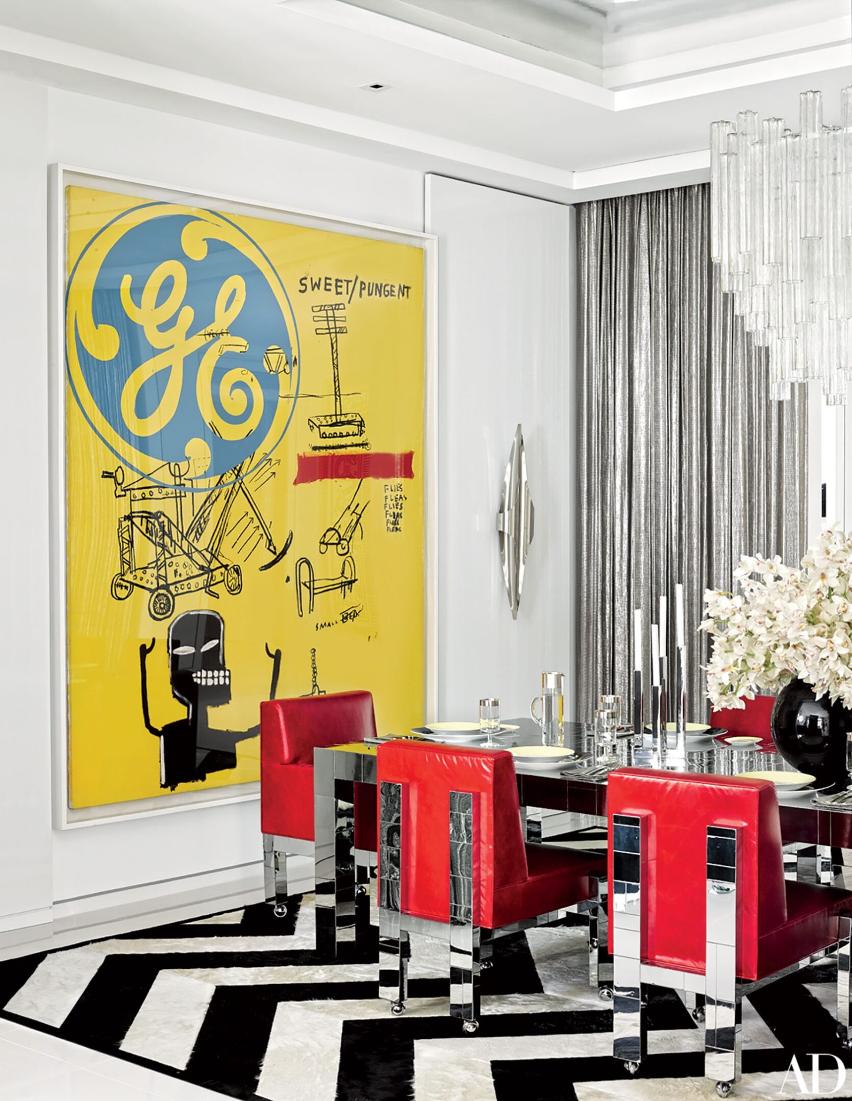
AHH. (Yeah, I’m like, screaming at my computer while writing this – hope that level of enthusiasm is coming across.) I cannot tell you how much I love this out-of-the-box usage of two *big* Murano chandeliers. We’d normally see a long, vertical lighting fixture over that dining table on the left (you can grab the interior design school-approved traditional dimensions here), but how special do those two petal chandeliers feel? It’s unexpected and beautiful and the symmetry framing the art is just, like, AHHH! (The screaming is back!!!)
I can’t believe how great these fixtures look in this kitchen, too. If I came up to you and was like, “hey, can I hang two uber-glam vintage Italian chandeliers in your minimalist mid-century kitchen,” your answer would probably be “GIRL, PLEASE COOL IT with these insane hypothetical scenarios in every post.” (That’s the long way of saying “no thank you.”) But it makes such a huge difference here – the space is way more elevated by the more surprising light fixture choice. It’s such a great balance, don’t you think?

SO well collected, designed, and styled. Everything here is an absolute winner – bone inlay chairs! Tile floors! Stained glass windows! Frescoed ceilings! Even the curtain rod is special!!! – but it all sings together, right? It’s maximalism done right. The chandelier here is so dreamy, too – it’s visually lightweight enough to keep your eye moving through the space, but impactful enough to hold its own in such a bold and vibrant room. It’s simultaneously playful AND chic. GAH. Masterful, guys.

ARE YOU KIDDING? I’m not normally a Louis XVI chair gal, but I will absolutely make an exception for this sitting room. It’s just so fun – like, I feel like I have a great idea of the person who lives here – and the balance between the classic floors, incredible ceiling, 80s track lighting (look close, it’s up there), milking stool, and SPECTACULAR chandelier literally has me losing my mind over here. I kind of love the reminder that if the bones are good, you can kiiiinda get away with doing whatever you want. It’s nice to not overthink things, you know? (Paint your chairs! Leave your tile floors! Throw a log near your door! It’ll all work out!)

Traditionalists, rejoice – there’s something for you, too. Picture something more classic here – maybe something in brass with a bunch of arms that all have those little lampshades on them? You know the ones I’m talking about? – and it falls so, so flat compared to all the personality that this green glass chandelier brings to this space. I would put this fixture in my house in a FREAKIN’ MINUTE. I don’t care that it’s huge. I don’t care that it’d be about 4′ off the ground and that I’d have to walk around it every day. It’s worth it.


Y’all, I gotta hit the lotto. (Can we please manifest it? I’ll throw a party, like Emily did at the first Portland project, so we can all ogle the petal fixtures that I would obviously be investing in.) I just love that they’re simultaneously so quiet and so impactful – there’s not a ton of visual clutter, like you often see with chandeliers that have a ton of arms or a large horizontal presence. These are just so soft and light and GAH. Are you starting to see what I’m seeing? Are you picking up what I’m putting down right now??? These Murano chandeliers look great everywhere, guys!!!
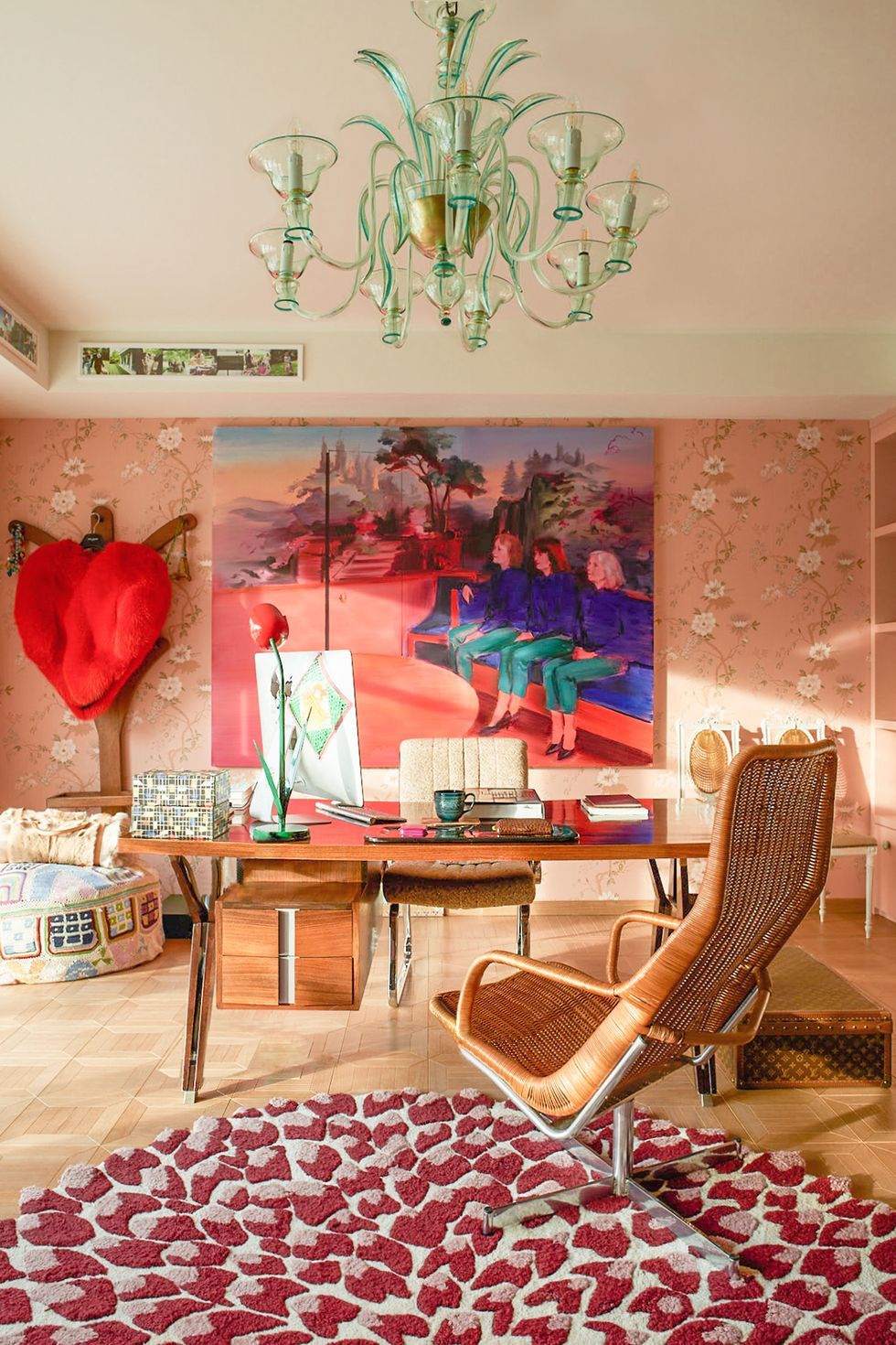
Case in point: AN OFFICE. Who needs a semi-flush mount when you could amp things up with a vintage chandelier? And, like, look how those peach-colored walls are reflecting off the mint glass. CHEF’S KISS. Also worth noting is that there is a full-on Mac desktop in this photo, which I literally did not even register until I stared at this shot for about 5 minutes straight. It’s a pretty compelling case for going bold on the lighting, yeah? (It’s also nice to see a fully styled room with some interior soffits – I know that we got a lot of requests around working around more “cookie-cutter” or “white box” home features, and this is just proof that you can add a ton of character and personality with just decor elements.)

Or you can add the aforementioned character and personality with architecture that’s supported by decor elements. EITHER WAY. I pulled this shot because I love how these two fixtures interact with each other – I know that picking lighting for an open concept floor plan can be a biiiiit of a nightmare (understatement?), so it’s fun to see examples of two TOTALLY different lighting styles working so well together.

I know we’re going hard on the color and pattern here, but I love this room because it swung hard in the opposite direction – instead of going huge and filling up all the vertical space, this chandelier is scaled *juuuuuust* right. It’s a little on the smaller side, which is dynamic and interesting in a WHOLE new way. I kind of love how size and scale rules don’t necessarily apply when you’re working with such unique fixtures. Also, this is just such a great use of a super narrow, design-agony-inducing room. Love it all.

I MEAN. Hit me with a big, clear statement chandelier over a dining table ANY DAY OF THE WEEK. (I have one of these vintage lucite ribbons going up in my dining room – the vibe I’m going for in there is “disco deco” – but in another world where I have multiple dining rooms for reasons I still cannot imagine, I’d absolutely splurge on a Murano version.) The texture of the chandelier on the right is just unbelievable, too. Like, y’all, SOMEONE MADE THAT. In a boiling hot concrete room! They turned a billion degree hunk of sand into a THAT! We don’t give artisans enough credit. I don’t even have a full set of CUPS in my house and people are out here making massive, one-piece glass fixtures without breakage. UNBELIEVABLE.


These are my two favorite shots in the whole post, I think!!! Y’all, I just ADORE these oversized fixtures. They create such a sense of place, you know? Like, the standard design wisdom is to create zones in your home using rugs to ground each different space – not here, though!!! If adding a rug doesn’t make sense with the layout of your space (like in the shot on the left) or if you’re just trying to let your floors shine (you guessed it – like in the shot on the right), creating a zone by anchoring from the top of your room feels really original and considered and ~designed~. (And while I have you, did you see that book matched stone on the left? ARE YOU KIDDING?)


I mean, you get it at this point, right? Check out these side-by-side comparisons real quick, though: one fixture is super high and a little tiny; the other is a liiiiittle wider than we’d normally see at a table of this size. Two pink and green rooms, two different styles of Murano chandelier, two SLAM DUNKS. They always look awesome, pals. (I can’t believe it either. Like, this post should probably just be renamed “the ceiling light style that looks good everywhere,” because it’s true.)


AHH! (Am I screaming about the color palette on the left? The cutest littlest guy with the cutest littlest legs I’ve ever seen on the right? The super creative use of cord swagging to hang chandeliers in unexpected places? To no one’s surprise, the correct answer is ALL OF THE ABOVE!) Honestly, though – I know firsthand that trying something a little left-field in your home can be intimidating or scary but this feels like SUCH a great and accessible entry point. Like, in my case, I don’t think I’ll be able to afford the 6′ chandelier of my dreams (and I also don’t really have space for it, but that’s neither here nor there) – but this? Swagging a lil’ guy somewhere? I think I can swing this.

I’VE BROUGHT YOU FULL CIRCLE. We started this post out with two pink chandeliers and that’s where we’re ending it, too! My obsession with Murano lighting started when I was trying to figure out the ceiling fixture for my bedroom – I’m really leaning into the whole “saturated hits of solid color” thing, y’all – and these have been such great inspiration shots along the way. In an ideal world, I’ll be able to source a piece that’s a similar size and scale the one on the left (or, you know, one of you will magically be selling one that happens to be in my price range, which is currently $very low)…but if not, it’s helpful to see that a smaller-sized version would be just as lovely, too.
BUT OKAY. Out of all the things I’ve tried to sell you on over the last few years – weird color combos, weird colors presented as neutrals, dinnerware shaped like vegetables, gifting closets, the list goes on!!! – I have a gut feeling that this one may end up being the favorite. It doesn’t feel particularly attached to any one decor style or architecture – there’s something for all of us! WHAT SAY YOU??? Can you see it? Do you like it, too? Let’s chat. PLEASE?! xx
PS. This is my favorite Italian Etsy store for Murano lighting. I couldn’t leave you hanging. (I wanted to – I don’t need more competition for the affordable ones!!! – but I guess sharing is caring? That’s what I’ve heard, at least. Let me live vicariously through you while I save up for my own chandelier!!)
Opening Image Credits: Design by Lázaro Rosa-Violán | Photo by Ludovic Magnoux & Martin Mendez | via InteriorDesign.net